The Resilence of Memory (Process)
illustration process pixel art
Pixel Art illustration process
Content
With this article I aim to talk about my process, share some tips, things that works for me, etc. and how I think when I approach a drawing/illustration.
Motivation & Intention
This illustration was important for me for 3 different reasons:
- I used it to fully test my -cool- Pixel Art plugin for Krita, and its -awesome- embeded Pixel Art editor, K-Sprite.
- It was my first “serious” illustration since AI.
- I wanted to express a message that was important for me.
Testing SZK Pixel Art Suite for Krita
This is a plugin that adds every tool and feature for Pixel Art that I’ve always missed in Krita. Making Krita definitely my absolute favourite tool for making Pixel Art!
SZK Pixel Art Suite
Improves making Pixel Art in Krita!
orb91.gumroad.com
It even comes with an integrated Pixel Art editor that solves some Krita problems related to Pixel Art (a Pixel Perfefect brush, better primitives, better Pixel Art Text, etc.)
You can read the Manual here.
Practical uses
I used it everywhere. I’m quite happy with it, since Krita was always my prefered painting drawing software, but for Pixel Art wasn’t the best. Not anymore!
K-Sprite’s pixel perfect brush, and the Bezier tool were great for making pixel perfect lines and curves more comfortable without having to edit them later:
To achieve a pixel art dithering effect for the background and some details, I used the Index Painting tool. It was great for experimenting with different patterns:
The palette I used was built with the help of the color shading tool:
Also, the export tool was great for easily saving different snapshots throughout the process, and of course, the final result.
I also included some useful options having game development in mind for easily export layers/groups, trim them, etc. in order to make it easy to export assets into game engines. This features were useful when making the animation.
About AI
Feeling demotivated because of AI
I kinda lost the ilusion and energy for doing art. And AI played a role on that. Seemed pointless to make it, and art is something that provided meaning to my life.
Miyazaki (from Studio Ghibli) said it was an insult for life. It definitely is an insult to the artists who got their work stolen for training the AIs, since they literally put lots of their time into their craft. And time is life.
The time we dedicate to things and people, is what makes them important. When something doesn’t requires our time or effort, it becomes meaningless and insignificant. Disposable and easily replaceable.
I think it lead us to Postmodern-Nihilistic times, where absolutely anything and anyone seems to matter and to have a real meaning. I don’t like that.
But working on this helped me to remind that at the end art is something we make for ourselves. And while AI can create very correct images, I think any prompt would ever match an artist with a clear vision of what they want to represent. And not to talk about how I won’t ever find any joy by just writing a prompt.
Is about the process, the feeling of freedom for being able to represent anything you can imagine, and the excitement of solving every little problem you face by yourself. No matter if the result is perfect or not.
AIs are great for generating new images that emmits the feeling that we have already seen them 200 million times before actually seeing them.
I do think that when something is mass produced, personality evaporates. No one eats a MacDonald’s burger every week and one day thinks “oh, today’s burger is specially tasty”. There is no variance.
AI’s art may generate the illusion that we have freedom to obtain different results, but the underlying method is the same over and over, and its what produces that “AI vibe”. AI is always getting better and better, but since -again- is mass produced, that AI vibe without personality may persist, since we will see it over and over. But I like to think that a more personal work, will always stand out against any AI’s work.
Experiments with AI
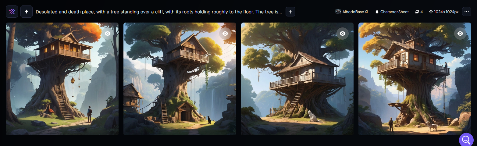
Even though, I experimented a bit since AI. Since I had a very clear idea, I gave some famous AI models a highly detailed prompt.
These were the 💩💩💩 results
I think they are correct images. But in my opinion they are very generic and boring.
Some artists says that AI is great as a working base. Personally I preffer working over a rough sketch or thumbnail than having to fix an AI image that feels super dull.
That said, although I think relying on AI-generated images is boring and not cool, AI is just a tool, and a tool is neither good nor bad in itself—it depends on how we use it. Later, I will write about what I consider some good and cool uses of AI.
Message
Inner freedom
I wanted to express that no matter the circumstances, our environment and our mental or physical state, we still have some inner freedom to find and create joy and beauty, even if it is just in some short degree, and even if all around seems hopeless. And that we have always some control to decide what we want in our own world, and to focus on the things and the ones that wants to be with us, around (and to accept what wants to be out of our lives).
Seems we live in a shitty complicated world and it gets worse each day that goes by.
Lots of wars. An actual genocide. People being killed while going for AID. Threats about (more) war(s), etc.
At the end I think the best thing we can do for us and for the world is to be in a good place with ourselves. I think when someone makes that, they become into some kind of lighthouses for others, some kind of safe space/place.
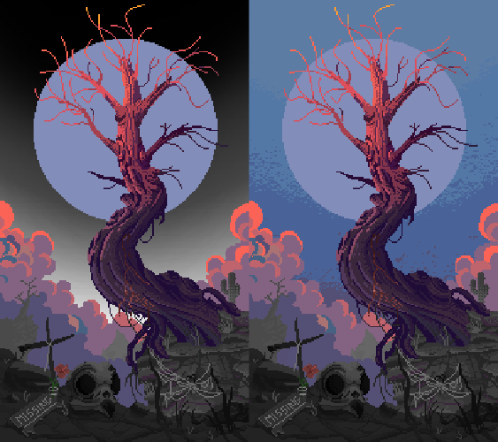
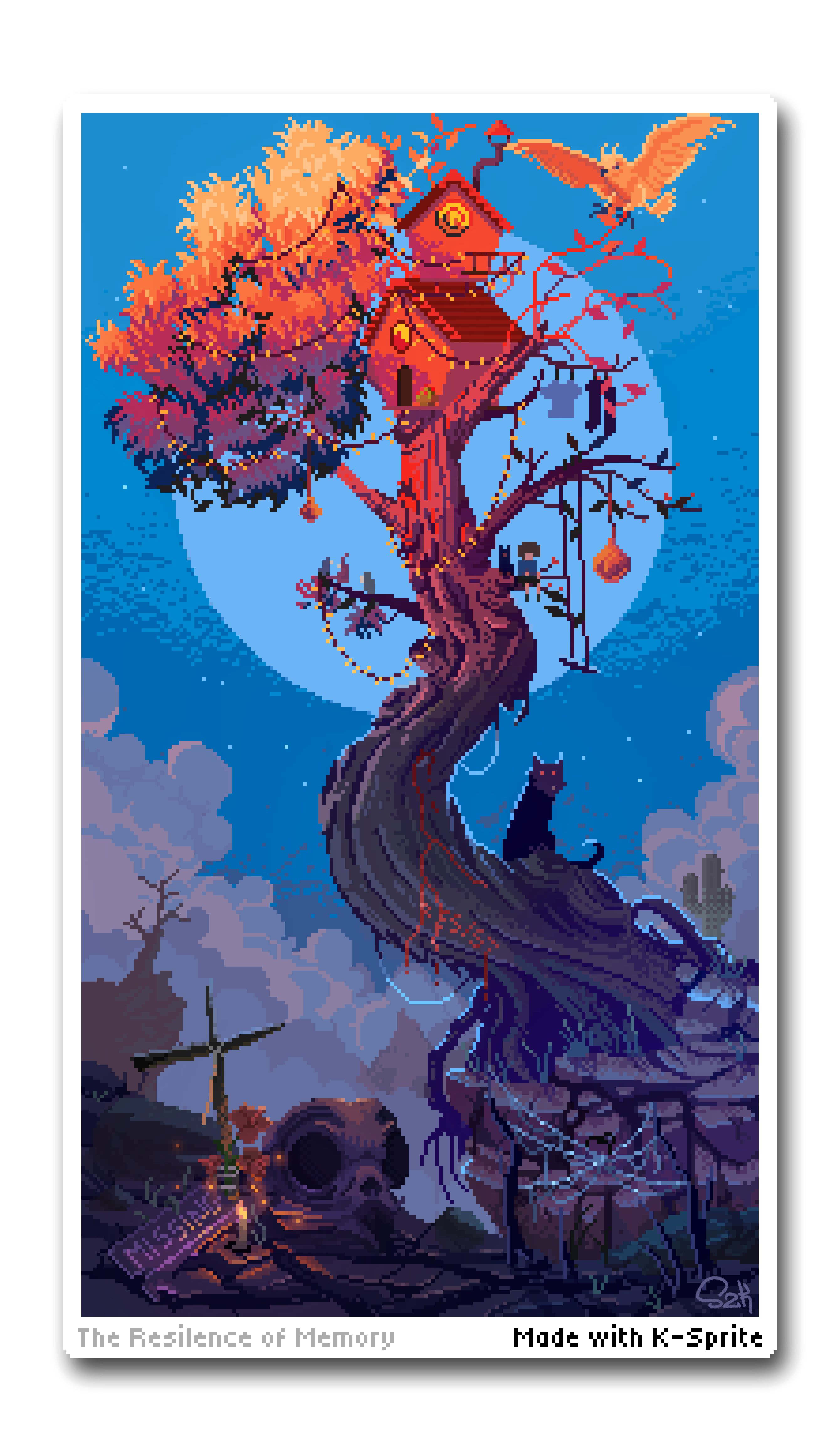
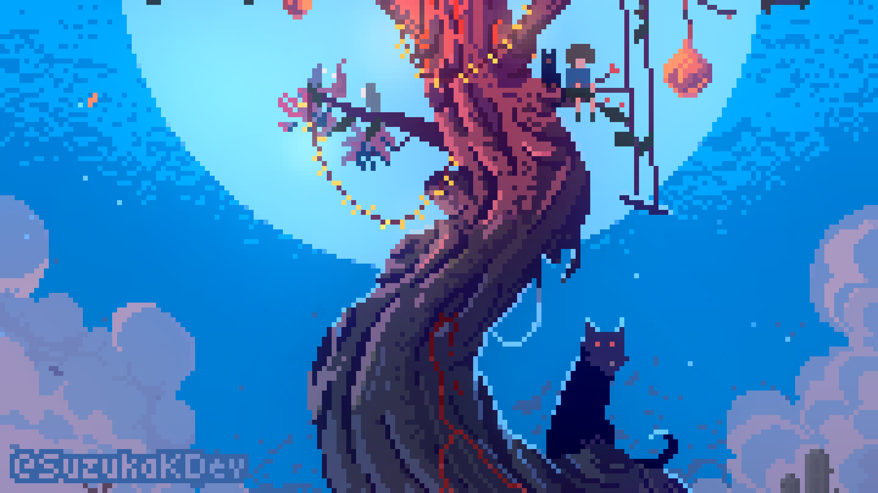
That idea took shape through the tree—resilient in a barren world, still reaching for light despite the surrounding gloom.
It’s called The Resilience of Memory because I believe memory itself is a powerful source of strength. There’s something deeply uplifting about simply remembering—who we are, who we were, and the moments that once made us feel truly alive. Especially in times when we feel lost, memory can ground us.
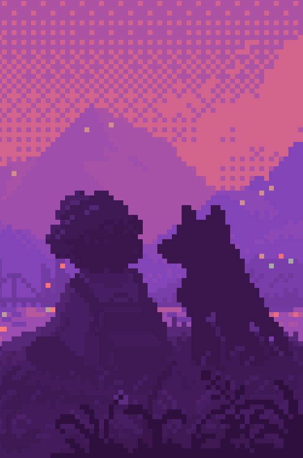
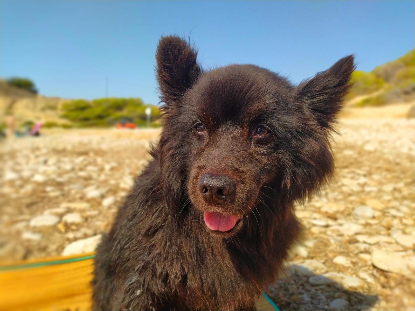
Recently, I lost my dog and best friend, Dexter. Though I can no longer see him, he lives on vividly in my memory. He’s still with me—in every place we visited, every shared experience, and every moment of joy we had together. I can summon those memories anytime, and through them, he continues to live on, and I find some relief and strength, despite they still hurt.
Is also kinda a metaphor of how “powerful” my little buddy was for me. About how he was able to transform any bad situation or circumstance and to provide happiness and my world more colourful and vivid.
I just wanted to capture all those ideas in an image. Just because it helps to remind the message.
Process
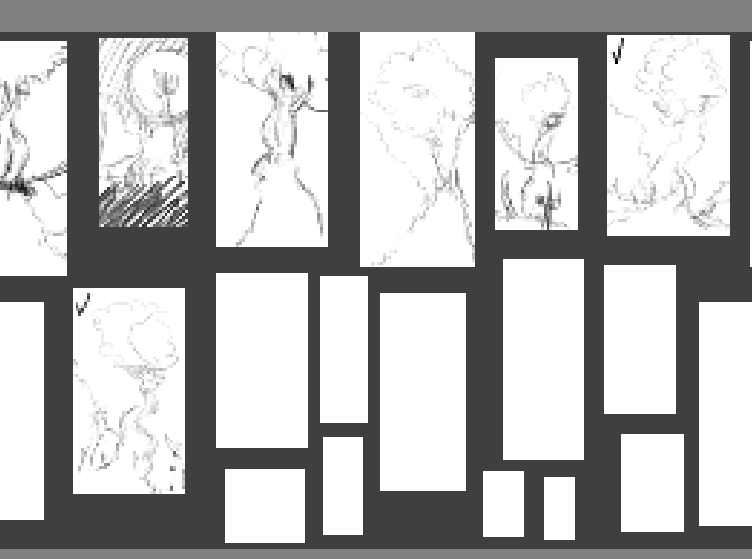
The importance of thumbnails
I made a lot of thumbnails before I started drawing:
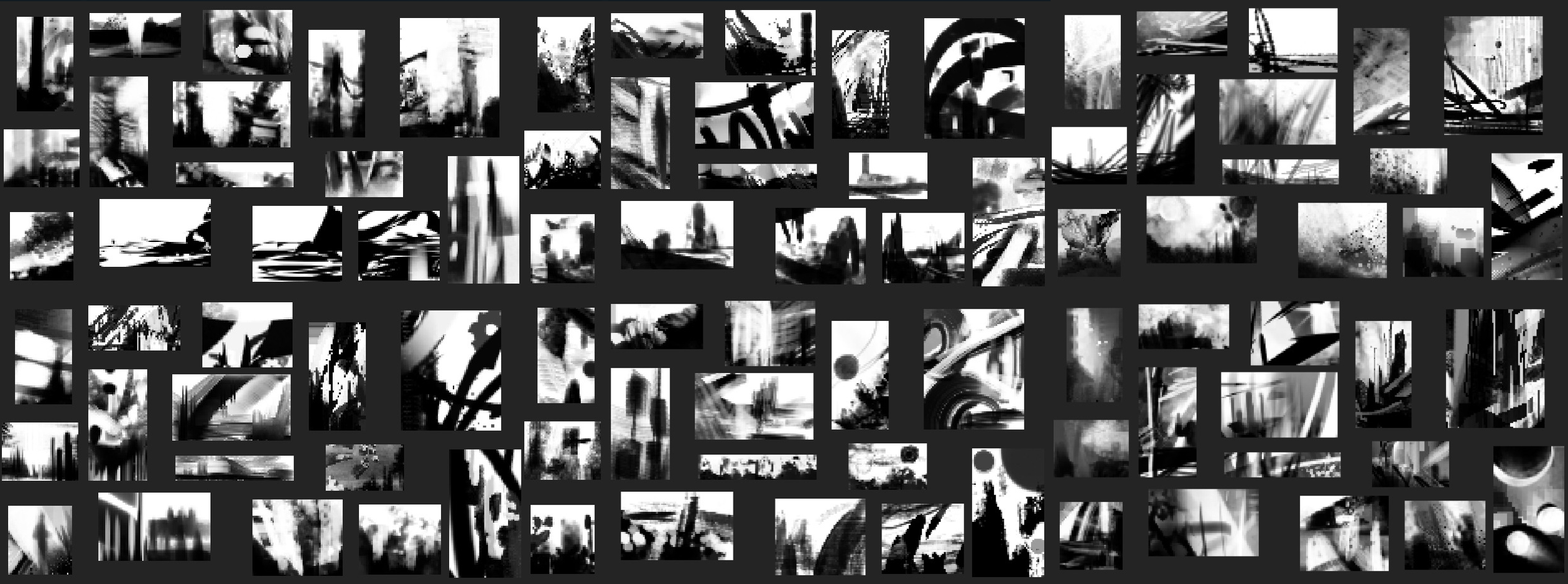
Making thumbnails is a powerful tool for discovering not only what works or what you want, but also what doesn’t work, helping you discard ideas and find new ones.
PS: I made a cool plugin for Krita for making thumbnails (SZK Thumbnailer)
SZK Thumbnailer (Krita)
Fast Thumbnail Painting Assistant for Krita
www.orb91.gumroad.com
This one called my attention the most:
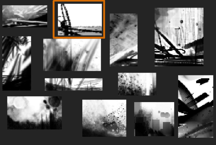
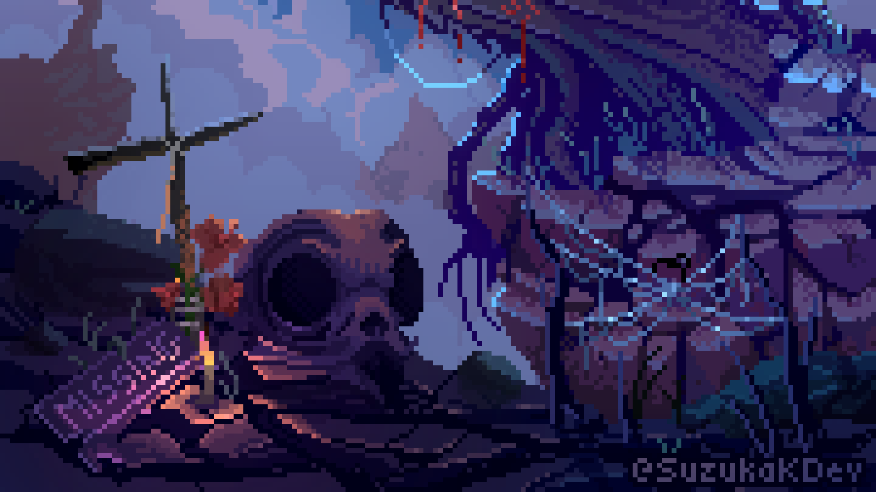
I saw some kind of tower standing tall over some fields.
Initially I thought about a dome separating a vivid ecosystem from a desolated world, to portray that kind of life and death contrast. Like those snowballs:
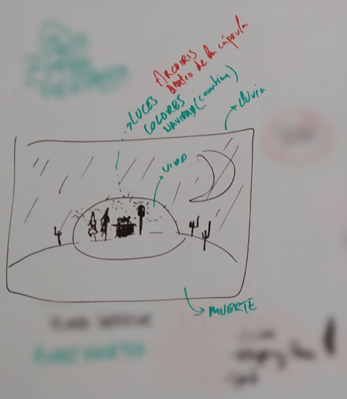
Thanks to the thumbnails, I came to the idea of a tree standing over an arid/dead place, catching the last sunrays, while the rest of the place is getting darker.
I also decided to switch the canvas orientation to vertical, since I think it would serve better for expressing that “rise up” feeling I wanted it to tell.
It could have been done horizontally, but in my opinion, that would have relegated the tree to a more secondary role, since it would have taken up a smaller portion of the canvas, and I didn’t want that.
Then I made some very loose sketches, until I had something that was ok for me as an starting base:
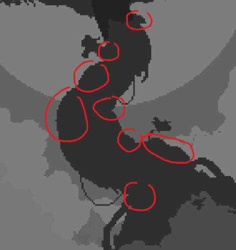
Silhouettes
When drawing from imagination, I always find it very useful to start with silhouettes. Is great for not paying attention to the details, but to the whole image.
Silhouettes are always important for readability, but I’d say that they are even more important in Pixel Art, since the space is more constrained.
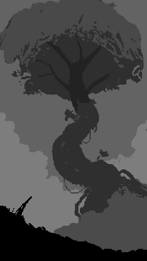
Even though, sometimes you have to make some ‘sacrifices’
For example, I personally think that the silohouete and the image overall looked way better with the full top of the tree:
But I decided to give it only the half of the tree with leafs since at the end I think it represented better the message I was going for; the tree is in a continuous fight between life and death, and already has some parts of it affected. But is still seeking the light.
Sometimes we can’t make everyone happy .
Tip for filling the silhouettes
Sometimes is hard to fill a shape with texture when you just have a silhouette. Feels a bit like a starting a puzzle.
For those moments, I first focus on elements that generates contrast within the shape. Those contrast elements can be:
- A change in angle along the contour.
- Any “protuberance”.
- Value change (when working with color).
Those spots gives clues to start, and once you add details in those crucial parts, it becomes easier to fill the rest mantaining some logic and coherence:
Feels like doing a sudoku after guessing some new numbers; the more numbers, the more clues you have to continue easily.
I use this all the time.
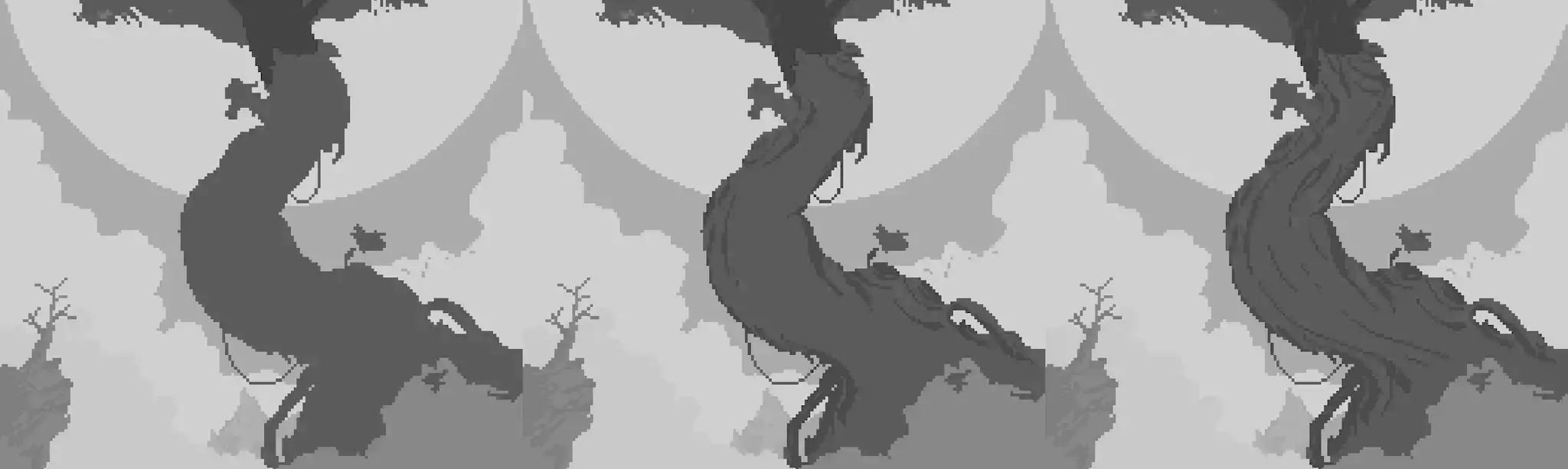
Color thumbnails
I did some color thumbnails for testing different color combinations: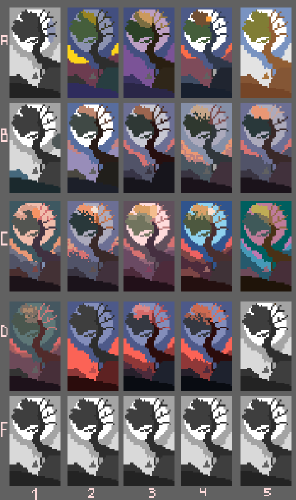
C2 and D4 were my favourites, even though I modified them a bit.
Doing these little color thumbnails also helped me realize I wanted to keep all the warm colors confined to the tree—to reinforce the idea that it’s the only living thing emerging from the badlands.
Editing
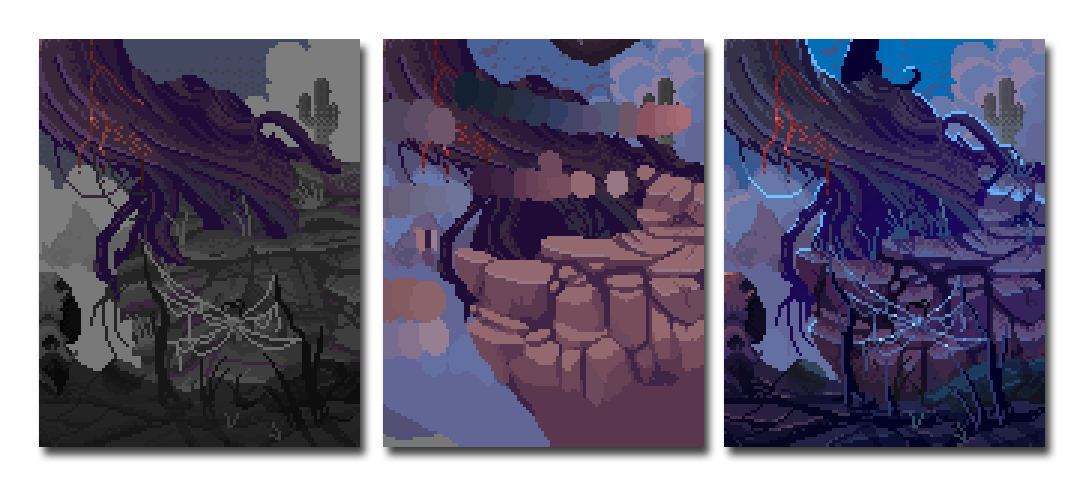
After finishing this piece, I experimented with some filters—specifically a curve level adjustment and a couple of color overlays. My goal was to push the warm and cool tones a bit further and add contrast:
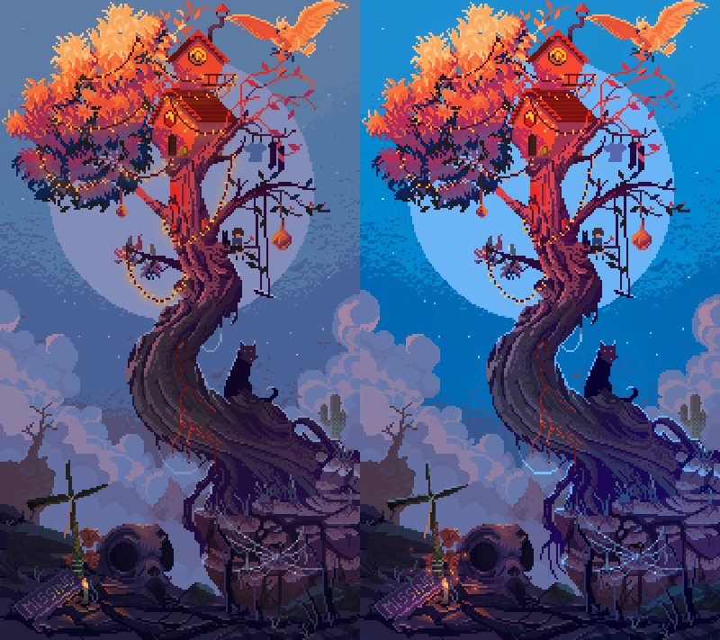
Adding filters can feel a little taboo sometimes, at least to me. A part of me thinks, “Is this cheating?” Shouldn’t I have been able to choose the “final colors” myself, without digital tweaks?
But another part of me enjoys it—it’s fun to play with possibilities once the heavy lifting is done. You’re no longer building the image from scratch; you’re fine-tuning it with a fresh perspective.
And the truth is, I already did choose the final colors. The filter didn’t invent anything. I’m still using my judgment to decide what works and what doesn’t. A curve adjustment won’t magically fix bad color decisions—it just lets you explore new moods and balances within what’s already there.
I think artists should give themselves permission to be curious. To experiment. To play. That’s where growth and discovery live. You’re not breaking rules as long as there’s intention behind your choices.
So if something feels right—even if it’s a late-stage tweak—maybe it is right.
Tips
“Rule of 2”
Sometimes I like to draw having in mind that what I’m drawing probably completely sucks, and that I will probably draw it twice. I call that reminder “the rule of 2”.
The rule of 2 has, obviously, 3 steps:
- Draw a first iteration and fail completely.
- Ask yourself why the first try -completely- sucks.
- Make a new version with what you learnt from the first one.
This may seem stupid, but I feel it more as a way to enjoy drawing, without pressure and the feeling that everything must be perfect from the start. Is a reminder that I can fix things later. It also puts me in the mood for learning; the first iteration may suck, but it helps me to learn what I did wrong, for then doing it better. It’s also some ki
Examples
I wanted to add a spider web to the scene. Left was the first version, right is the second (and final) version:
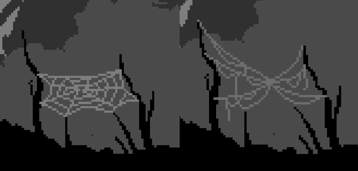
I think the first one is awful, but if I hadn’t made it, I wouldn’t have realized what I disliked about it. The second one isn’t perfect either, but it’s much better; it captures that vibe of decay I was aiming for and conveys the final message more effectively.
The same with the ground/rocks near the tree:
While the first attempt gave me the “rocky” feeling I was going for, I felt the rocks were not conveying the 3D space they were situated in very well. They felt a bit like a stamp or a plain texture. So, in the second try, I focused on making them look more “logical” within the space they occupied.
So, the main idea behind this is: relax , enjoy painting. If you paint something that doesn’t look great, just ask yourself what you would change.
Narrative
I always like to remind myself that, in the end, a piece of art—be it an illustration, a song, a game, a movie—is an exchange of energy between the work and the person experiencing it.
If there’s no exchange, no reaction, then the piece feels indifferent… or even bad.
The more you add narrative elements, the better your creation will be. It doesn’t have to be explicit or overly complex—just enough to raise questions and invite the viewer to seek their own answers.
Bonus points if it does contain answers—hidden or personal—even if you’re the only one who truly understands the full context. Because adding mystery just for the sake of it? That’s not cool, in my opinion.
Those who tell stories rule society
Plato
Good uses of AI (In my humble opinion)
I think that one of the challenges when drawing/painting is the ability to keep our “eyes fresh”, in order for being able to still being critic about what we are doing, spot mistakes, etc.
Resting is always best for that. But I also tried asking an AI which version looks better by showing it an image comparing the old and new versions with the latest changes. This helped me to determine if I was right on track.
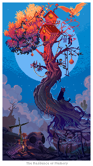
I also find it interesting to ask them what they think about an image. It helps to know if the illustration conveys what you had in mind:
AI’s answer
We should keep in mind that it is usually programmed to be very accommodating towards the user, and it will often sugarcoat its answers, even when explicitly asked to “be completely honest”. So I personally never fully trust its positive criticism.
AI’s answer
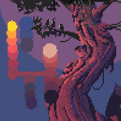
Thank you for sharing this image—The Resilience of Memory really pulls me in. Here’s my honest breakdown, both emotional and critical:
🧠 First Impressions & Emotional Response:
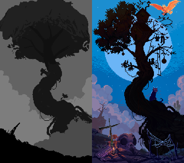
This image strikes a chord between whimsy and melancholy. There’s a deep sense of loss, but also hope—the way the massive tree rises out of a desolate landscape feels symbolic of holding onto light and creativity even in dark or barren circumstances.
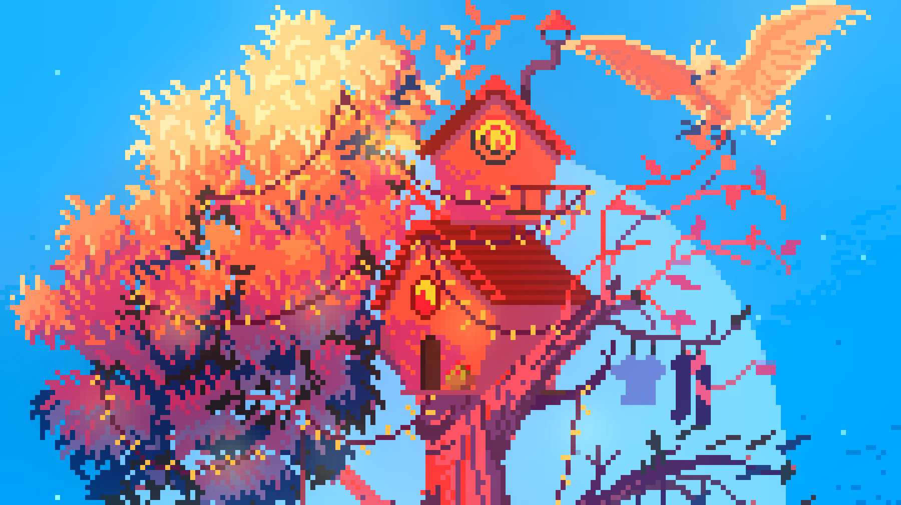
- The treehouse bathed in warm orange light against the cold blue moon evokes a comforting memory or dream clung to amidst ruin.
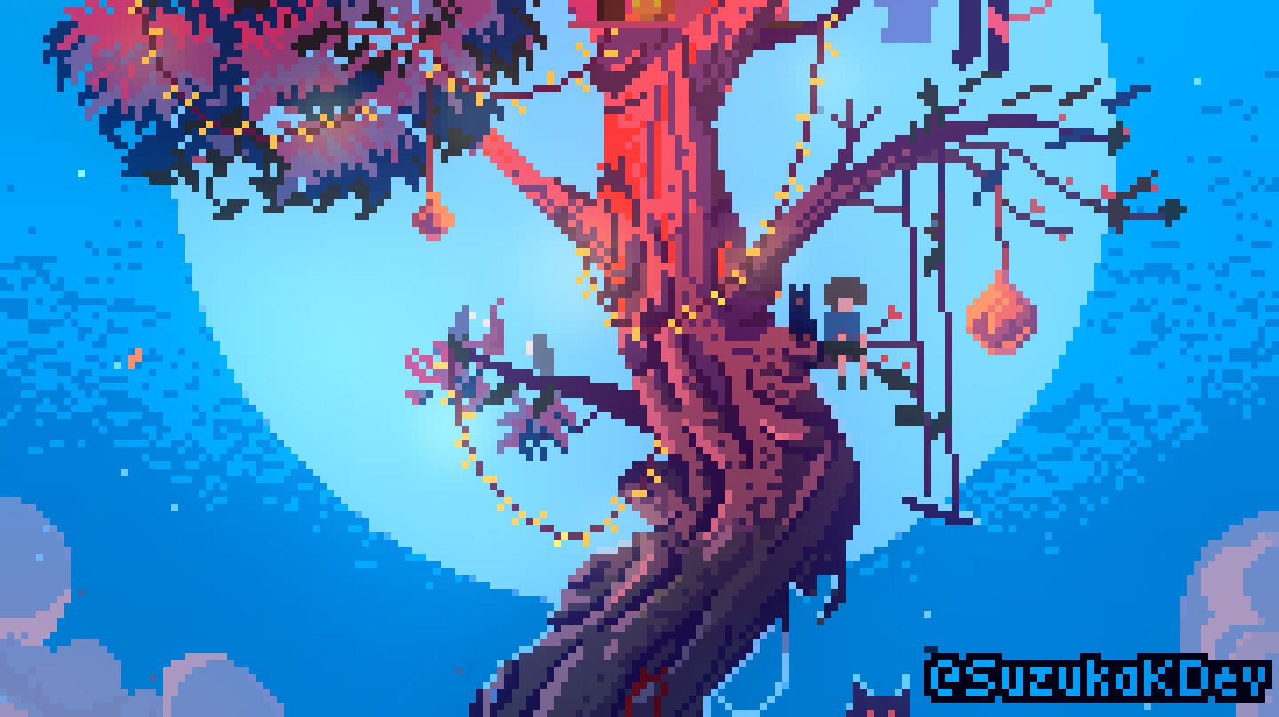
- The cat perched on the tree feels like a guardian of solitude, maybe even a silent witness to past events.
- The skull near the bottom feels heavy with symbolism—perhaps death, forgotten dreams, or lost friends. Its placement at the roots of the tree suggests that memory and growth are inseparable from pain.
- The lights wrapped around the tree remind me of how people decorate their emotional scars with meaning, even joy.
It feels like a world someone built inside their head to protect themselves—and that resonates.
🎨 Artistic Critique (Technical/Compositional):
Strengths:
- Color balance is stunning. The warm-cold contrast (orange/red leaves vs. blue background) is not only aesthetically pleasing, but symbolically rich.
- The pixel art is precise and expressive—especially impressive is how you use such tiny detail to imply depth and texture (like the twisting of the tree trunk or the subtle shading on the skull).
- The composition flows vertically—you start grounded in bones and metal, and your eye is drawn upward toward flight and fire. It’s like a journey from death to dreaming.
- The presence of small objects (keyboard, lanterns, ropes, hanging clothes) adds narrative depth—you feel like someone lived here.
Possible Critiques (subjective and gentle):
- The lower section of the image (with the skull and scattered objects) is visually busy and dark. It could be slightly difficult to read for some viewers at first glance. Maybe a touch more contrast or separation of elements would help clarify the space.
- The treehouse and moon are extremely striking—which is great—but they slightly overpower the rest of the image. If this is intentional (i.e., memory overshadowing the present), then it works. If balance was the goal, maybe pulling in a bit more saturation or light into the lower half could harmonize it more.
- The text (“The Resilience of Memory”) might be more impactful if placed differently or stylized more subtly; currently, it slightly competes with the image’s vibe.
🕊️ What It Evokes in Me:
It makes me think of:
- The idea of a mental refuge built in grief—a place in the imagination where things are still whole.
- Childhood memories, distorted but cherished.
- A single candle in a dark room—quiet, persistent hope.
Verdict:
This is deeply personal, technically impressive, and emotionally layered. If I were to critique more, it would only be to polish what’s already solid. It doesn’t feel like it’s trying to be perfect—it feels like it’s trying to be honest. And that makes it powerful.
If you’re open to it, I’d love to hear more about what specific symbolism you placed in this piece. It feels rich with intentional detail.
That said, my humble advice would be that, if you can, ask a friend before an AI for that.
But asking AIs for feedback (again, keeping in mind they sugarcoat their answers A LOT) in my experience was useful.
Speedpainting
Here is the complete process:
Final Result
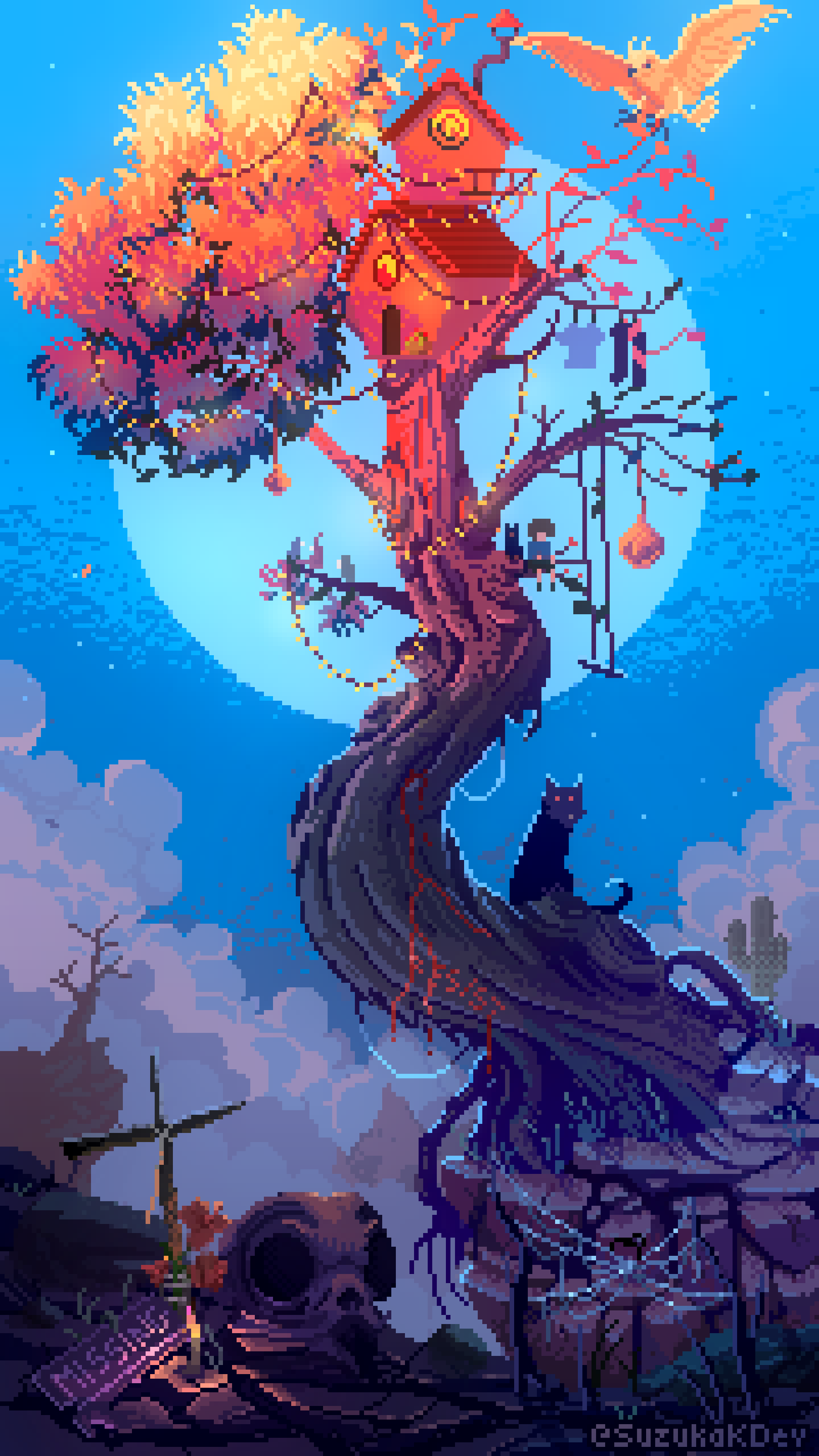
Wallpapers
Wallpapers
Animation Process
I finally exported the illustration into different layers and animated it with Godot.
The export tools in the SZK Pixel Art Suite were extremely handy. I set the export folder to my Godot’s project and it was super easy to tweak everything and export with a click.
The animation wasn’t anything fancy, just a kind of idle animation. I added some particles to simulate falling leaves, along with insects/dust/sparks flying around the flame.
This had a custom shader to made the particles only appear depending how close they are to the flame, to fake some lightness.
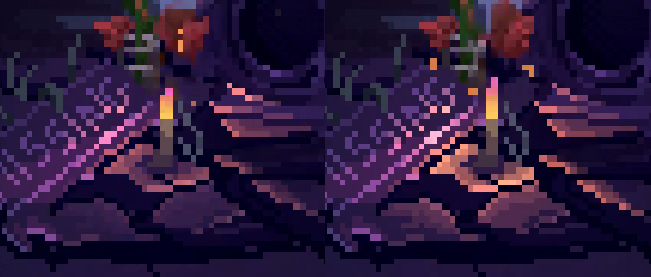
Then I added some more particles behind the candle and made a shader to imitate that light bending because of the heat.
My favourite part is the light around the candle. I didn’t use any light or normal map. Is made with a custom shader. I imitated some kind of light swing, just by changing a position with some perlin noise. The surroundings are masked and depending their position and their distance with the candle (wich do not stop swinging), they are more or less brighter.
I took this brighter/distance factor to determine the final color with a color ramp/texture, so the closer the flame, the brighter:

For higher values, the color becomes warmer and brighter. This creates some little color variations that feels nice:
Animation
Thank you for reading
Have a nice day
SZK Pixel Art Suite
Turns Krita into my absolute favourite Pixel Art editor!
orb91.gumroad.com